


![]() CompanyCI
CompanyCI
ILSHINWELLS' missions are human-centered company operations and combination of eco-friendly naturalist aesthetics. The management philosophy is people's health is the best. Well-being may be expressed as to ‘eat well and live healthy” however, this does not mean to spend luxuriously but to live in harmony and to live a life that I seek without concerning about others’ perception. We expressed the freedom and eco-friendly feeling as the leaves blowing in the breeze. Clean font of the simple lines is easy to apply the identity of ILSHINWELLS to any media. We used green color that of nature and plants. We also put various seasons into gradation of colors which is lime green of sprout on spring and dark green of bushes on summer.
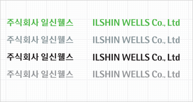
Standard Wordmark

Major Motive : Wipes soaked with breeze
Modification Wordmark

Color System

Pantone 877C (Silver)Pantone 872C (Gold)
When you reproduce wordmark color, the reference color should be based on four primary colors on a white background and 4 primary colors must be observed except black.
-
 RGB : R 128 + G 133 + B 131
CMYK : C 50 + M36 + Y35 -
 RGB : R 77 + G 172 + B 38
CMYK : C 70 + Y100 -
 RGB : R 26 + G 148+ B 49
CMYK : C 90 + Y100
RGB : R 166 + G 213+ B 19
CMYK : C 35 + Y100
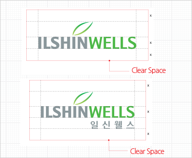
Identifier Clear Space Rule
Logotype Legal Name